

In this talk, Laura Ragone discusses strategies for architecting a robust color system capable of scaling to projects of all sizes. She’ll walk through how these approaches can be utilized to rapidly iterate on design decisions and may be adapted to modify color palette themes at runtime.
Introduction
I’m Laura and I’m an iOS engineer at Meetup. I’m excited to talk to you about architecting a robust color system in your apps. Over the past two years, my colleagues and I have had the opportunity to enact a radical change to the Meetup iOS code base.
Today, I’m going to share some concepts that I keep in mind when I’m configuring the appearance of an app:
- How to architect a basic color system that readily adapts to design iterations.
- How to leverage Swift’s protocols and protocol extensions to update and apps color palette at runtime.
- The legibility considerations when making design choices of color.
Why Make a Color System?
Firstly, accessing colors from a centralized location is convenient. It eliminates the hassle of hunting for specific RGB values each time they’re needed to configure a UI element.
Defining colors in this manner also enforces a consistent color palette throughout your platform. This helps create a uniform visual experience for your users, and will simplify the process of iterating on your app’s appearance.
To note, app redesigns are not exclusively linked to a major company rebranding. Apple’s Human Interface Guidelines change periodically. And example of this includes the end of the realism associated with skeuomorphism ushered in with iOS 7’s flat design.
With rumors of OLED iPhones on the horizon, the time is right to consider what a dark theme might look like in your iOS app. As reviewers have aptly observed, your color choices have a significant impact on your user’s experiences.
Architecture
We have two choices to consider. Which of the following should we define our colors with?
- An interface builder, or
- Programmatically
The question of customizing our views appearance using either approach can be polarizing. Interface Builder has become extremely powerful over the years. It’s likely that you’re already creating your views, storyboards, and nibs with IB.
Interface Builder
With access to a color picker from the utility panel, configuring UI elements in interface builder is easy. iOS developers and designers can share color palettes using .clr files. These files work both in Sketch and in Xcode.
The prospect of setting colors from interface builder by using this shared file is compelling. NatashaTheRobot has written an excellent blog post detailing this process.
Unfortunately, color set on UI elements in Interface Builder lack a common reference. Although your brand color may never change, other colors will. When using a shared .clr file, changing these colors using Interface Builder involves going through each nib to set new colors on affected elements.
Because Interface Builder for iOS currently supports setting only a single color on each UI element attribute, this limitation prevents us from customizing a view for multiple themes without programmatic assistance.
Programatically
Defining UI color objects programmatically resolves our common reference issue. Modifying all occurrences of a particular color involves updating code in a single location, and we can be certain that all UI elements referencing a color update is intended.
Unlike the interface-builder approach, programmatically referencing colors helps allow you to create custom themes. To start, create a UIColor extension to store the colors. This allows access to custom colors in the same way you would access other colors defined by UIKit. In this extension, we shall include a nested struct to define our palette.
extension UIColor {

// Mark: Nested Types

  struct Palette {
      static let ceruleanBlue = UIColor(red: 0.0 / 255.0, green: 158.0 / 255.0, blue: 220.0 / 255.0, alpha: 1.0)
      //...
  }
  // ...
}
Palette colors should include names indicative of the color’s hue. This will help us distinguish between colors in our palette at a glance.
We can now define colors within our UIColor extension, referring to those colors in our palette. Swift three introduced the ability to define class-computed properties from within extensions. Since defining a color does not typically involve arguments to dictate the color’s appearance, class-computed properties are a natural choice.
This is the approach recommended by the UI Color API reference when creating color objects with a predefined hue. Before Swift 3, a class function served this purpose. Should your colors rely on an argument to display appropriately, class functions continue to be a viable option.
Example
Consider this example from the UI Color API reference.
	class var darkText: UIColor

	class var lightText: UIColor

	class var groupTableViewBackground: UIColor
There are two text colors specified: dark for displaying texts on light backgrounds and lights for displaying text on dark backgrounds. The responsibility each color has is clear. The common color responsibilities included text styles, feedback indicators, background styles, and button states.
There’s no need to provide a one-to-one mapping between colors in your color palette and colors returned in your color roles. Both button-based and text-based roles make use of the same desaturated palette hues.
Integrating Themes
With the colors and our color system finally in place, we can begin the task of integrating themes. If you’ve previously added support for Dynamic Type updates in your app, this approach may feel familiar.
When the user forms an action initiating a change in the apps appearance, this information must be communicated to all views requiring an update. Because this information is of interest to an unclear number of recipients, we should emit this message using Notification Center.
Introduce a new protocol, ColorUpdatable, which will allow interested parties to respond to this information. This protocol will allow all color-updating types to share a common interface. Changes made using this interface reflect upon ColorUpdatable performing objects accordingly.
// A protocol which denotes types which can update their colors.
protocol ColorUpdatable {

  // The theme for which to update colors.
  var theme: Theme { get set }

  // A function that is called when colors should be updated.
  func updateColors(for theme: Theme)
}
The protocol is straightforward: the theme property stores which state the conforming object should display. We need this property to configure the views appropriately during its initial setup.
Next, the update colors for theme function is responsible for updating colors of all UI elements contained in the conforming object. Label text colors, view background colors, and tint colors should all be specified here. If your view contains children also conforming to ColorUpdatable, this function should call through to their update colors for theme functions as well.
With our common ColorUpdatable interface established, we can now address the task of observing color-update messages. To that end, we must create yet another protocol called ColorChangeObserving. For convenience, the ColorChangeObserving protocol will contain functions to both add and remove observance of notifications indicating that the color scheme has changed.
protocol ColorThemeObserving {

  // Registers observance of 'didChangeColorTheme' custom notifications.
  func addDidChangeColorThemeObserver(notificationCenter: NotificationCenter)

  // Removes observence of 'didChangeColorTheme' custom notifications.
  func removeDidChangeColorThemeObserver(notificationCenter: NotificationCenter)

  // Responds to 'didChangeColorTheme' custom notifications.
  func didChangeColorTheme(notificaiton: Notification)

}
In practice, you should call the function to add the color-theme-change observer early in your controller’s lifecycle. This should ensure that posted theme-change messages are received. Upon receiving the message, the didChangeColorTheme-notification function will be called. We can continue to extend our ColorChangeObserving protocol to provide it within default behavior.
First, we have a few helper functions to create. As I mentioned before, we need to post a customer notification indicating that the color theme has changed. The new theme where reconfiguring our views to display should be included in this notification’s user-info dictionary.
The theme from notification function simply handles the implementation details of extracting the theme from the notification’s user info. Returning nil, the theme is not found.
The magic happens in the update colors from notification function. We previously created the color updating protocol to provide a common interface for clients to specify themes and update colors. We’ll check here to discover whether our color-theme-observing object also conforms to color updating, updatable. If it does, we’ll instruct the object to reconfigure its appearance to match the new theme.
// Mark: - ColorThemeObserving

private extension ColorThemeObserving {

    // Returns the theme specified by the 'didChangeColorTheme' notification's 'userInfo'.
    func theme(from notification: Notification) -> Theme? {
        // ...

        return theme
    }

    func updateColors(from notification: Notification) {
        guard let theme = theme(from: notification) else { return }

        if var colorUpdatableObject = self as? ColorUpdatable, theme != colorUpdatableObject.theme {
            colorUpdatableObject.theme = theme
            colorUpdatableObject.updateColors(for: theme)
        }
    }
}
We should now extend conformance to color theme observing to all UIViewControllers. From here, we can call our update colors from notification function each time a color-theme-change notification is received. With this, any view controller, both observing color-theme notifications and conforming ColorUpdatable will automatically reflect the new theme.
// MARK: - UIViewController

extension UIViewController: ColorThemeObserving {
    @objc func didChangeColorTheme(_ notification: Notification) {
        updateColors(from: notification)
    }

    // ...
}
When working with table and collection views, we can take advantage of extensions. Because both UITableViewController and UICollectionViewController inherits from UIViewController, it’s possible to override the behavior we find in that last line to automatically reload data.
We still need to update our custom-color roles to accommodate our new themes. Using class functions in our UIColor extension, we can specify theme arguments to determine which colors correspond to each style. Then, we can switch the theme to return the desired palette colors.
extension UIColor {
    class func backgroundContent(for theme: Theme) -> UIColor {
        switch theme {
            case .light:
                return Palette.white
            case .dark:
                return Palette.black
        }
    }
    // ...
}
Inclusive Design
Having the ability to customize themes provides a wonderful incentive to begin thinking about your app in new ways - this is a good point to speak about inclusive design.
One out of 12 men and one out of 200 women are afflicted by some color-limited vision. This means about 5% of your users will never see your app as designed.
Apple introduced an incredible color filter accessibility feature in iOS 10. These filters do a remarkable job in increasing the contrast of all colors throughout the entire iOS system.
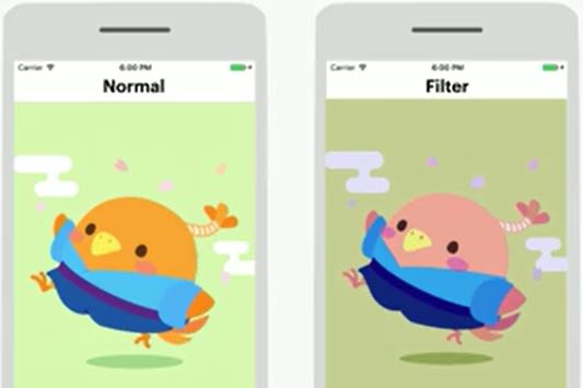
On the left is an unfiltered image. On the right is the same image with a green-red filter applied. If you aren’t affected by some form of colorblindness, applying these color filters may not be very useful.
In order to get a feel for how to best adapt our color system for sightedness concerns, we need to be able to simulate what an affected person would encounter. Ideally, this solution will address the full spectrum of color-limited considerations.
We can adapt our color system to use a library like Inclusive Color to achieve this goal.
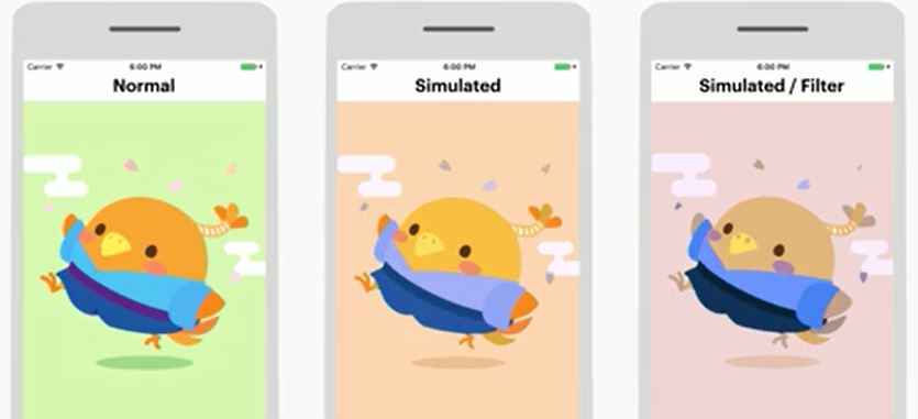
The leftmost image shows the contrast ratio between the color of the bird and the background is a respectable 1.6. In the center image, all colors have been replaced with colors consistent with deuteranopic vision, a form of red-green color blindness. In this case, the contrast ratio between the bird and the background is 1.2, a 25% decrease from the original image. It’s still cute, but noticeably more difficult to distinguish.
In the rightmost image, the deuteranopic color filter has been applied to the simulated image. This time, the contrast ratio between the bird and the background is 1.3, which is an improvement as compared to the appearance without the filter.
With our color system, adding the functionality to generate this simulated appearance is as simple as adding one argument calling one function in our UIColor extension.
Having the ability to simulate this condition might be useful in unexpected ways throughout the lifetime of your project.
Conclusion
First, making use of a monochromatic color scheme should work universally for all users. Rather than relying on specific color hues to determine importance, using a range of shades will allow users to determine the relative importance of information as compared to that of other elements on the screen.
Make a point to calculate the contrast ratio between foreground text and background elements. Text below 18 points should ideally have a higher contrast ratio than that a larger text to ensure information is legible.
Lastly, strive not to rely on color alone to provide feedback for your users. Although the notion of green for good, red for bad is understood in many cultures, those afflicted with the red-green limitations might miss the message when other visual cues are lacking.
About the content
This talk was delivered live in March 2017 at try! Swift Tokyo. The video was recorded, produced, and transcribed by Realm, and is published here with the permission of the conference organizers.

