

If you enjoy talks from 360 AnDev, please support the conference via Patreon!
ConstraintLayout 1.0 made building flexible UI easy, with a deep integration in the Android Studio layout editor. The recently introduced 1.1 version is bringing even more flexibility, with new capabilities like barriers or groups. This talk will take a deeper look at the current state of the library, why you should use it and when: architecture, performance behavior, examples of complex UI, animation capabilities, extending the library in your project via subclassing, and discussing some upcoming features.
Intro
Hello, my name is Nicolas Roard. I’m going to talk about ConstraintLayout. Considering this is supposed to be an advanced session on ConstraintLayout, you should know what it is. If you don’t, it’s an expressive layout manager. It’s basically trying to focus on letting you do flat layouts. I’ll come back on explaining a little bit about that.
It’s deeply integrated in Android Studio. It’s actually the same thing that works on the layout editor in Android Studio and on ConstraintLayout. It’s an unbundled library, which is great; it means that we don’t have to wait two years to get new readies. It’s also compatible with basically every device, and every system.
Why do we have ConstraintLayout?
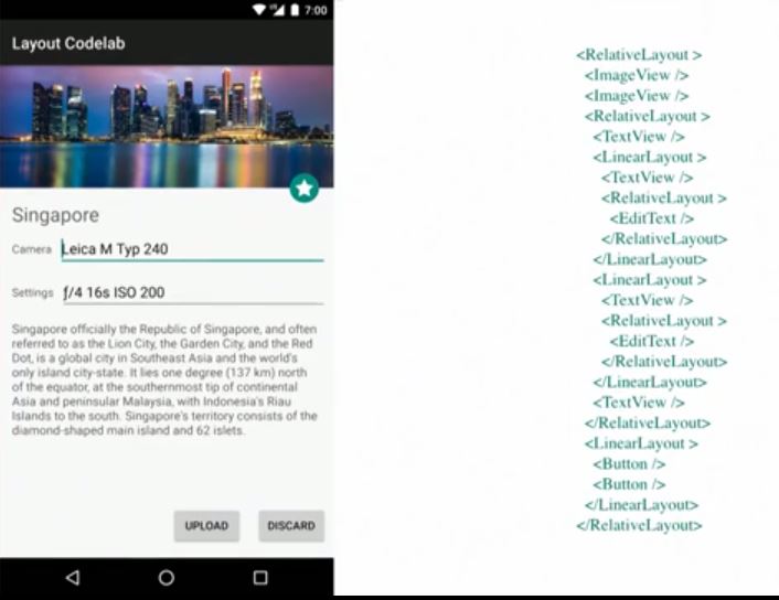
That’s a typical screen that you probably made yourself in some way. There is nothing special here. It’s a bunch of relatively odd counting widgets, images, buttons, and what not. It’s not even the most horrible layout I’ve witnessed. I’m sure it should look fine here.
The issue with that is if you look at in terms of the actual nesting, the hierarchy and what that means; you end up with something crazy, and that’s not great. I call that the Tetris model because it’s relatively easy at first. You just have blocks and you combine them; but it can get bad very quickly.
Once you’ve created your layout, even though it might have been relatively easy to do, it’s very difficult to change. If your spec changes, you probably have to redo a lot of your layouts. It also imposes limitations on what you can do with animation and transition.
Those layouts that you are using to set up with what your screen should look like also imposes clipping areas and things like that. If you want to move an element that’s really done, build the hierarchy and move it somewhere else; you can have some interesting issues.
More interestingly, at least for me because I was in that position, it’s not particularly helpful architecture if you want to build the design tool. There’s natural problem, a part that we can make a great design tool for, that’s probably good for you.
Finally, if you have nested hierarchies like that, performance can be become an issue. It’s less and less true, I have to say, simply because devices are faster and faster. That said, in many cases, you still need to at least be aware of that potential issue and remedy it.
Flat Layouts
What I would love is to get rid of all of that hierarchy. We move all the views on one end, and all the layout information, all the rules, all your design, and everything that’s specified for what your screen should look like, we move it into one place. I think that’s a key concept here.
The layout should not be related to your view hierarchy. If you do that and you completely intertwine the layout rules with your views, you tangle them together. Which goes back to what I was saying earlier about the difficulty of changing it. You can call it flat layouts, if you want.
This idea is that as much as possible, you should try to have a shadow view hierarchy. This doesn’t mean that you have to have a single level of hierarchy, but as much as possible keep it pretty shallow. We try to avoid mixing the layout definition, the rules, with the view hierarchy. This makes it a lot easier to manipulate into a graphical editor, much easier to change, and animation is nicer.
There’s often a small point that maybe I haven’t talked much about. If you put everything at one place, it makes it a lot easier to optimize, rather than to having to optimize every single layout manager, and sometimes there is some optimization you cannot do because they address cross cutting. If you put everything in one place, you have a lot more opportunities. If you take the same exact screen and you convert it into something with ConstraintLayout, that’s what you end up with; something that is definitely shallower.
It also has some impact on performances. In that example that’s running with ConstraintLayout 1.0.2, which is the latest table release that we did, running on Nexus 5X; we were a little bit faster. There’s actually going to be a blog post from the Dave Rel about how to get those performance measures and explaining how they got those results; which in general I’d say applies to way more than just ConstraintLayout. I think that will be a great blog post to read.
Making It Flat
If we do that, if we want to have something that’s really flat, and all those nice features if it’s flat, this is great. There’s one caveat. The need means that whatever big single layout manager we are doing needs to be excessively expressive. What you would like is something that can reproduce all the existing layouts. How do you do that in a single one?
That’s tough. Luckily, some very bright people did a lot of work in 1947. Dantzig created the simplex method, which is basic software for linear programming. Think about gigantic matrices representing an equation that you want to optimize. You have some constraint on this equation. You put that into a matrix, magic happens, and you get an optimized solution. It’s actually very interesting, but let’s move on.
Cassowary
Closer to us in ‘97, Cassowary’s algorithm was published. It’s basically a tweak on the simplex method. In a sense, it is a simplex method, but with a couple of extra features. One, is that it provides a method to build such a system incrementally and date it incrementally, which makes a lot of sense when you are dealing with realtime UI, and things that have to react instantly when you maximize your window and things like that.
It has a bunch of things on how to more easily represent the type of problem you would have to represent for layouts. It’s very flexible. Compared to some simpler scenario, or some simpler method, it can be relatively heavy because, first you have to write the right equations. Then you have to put all those equations into matrices and deal with all the associated errors, which are viable as well. You end up with gigantic matrices. Even if you try to be careful in how you do that in your implementation, that can be pretty heavy.
If all you are doing is very simple, something like a linear layout, if you ever were curious and looked at the code, it’s pretty damn simple. Of course if you have to build up another cathedral to resolve the same problem, even if your cathedral is very optimized, it might not be so fast. If you build the cathedral, it’s probably going to be pretty intensive memorywise. Indeed the first implementation of Cassowary were not exactly super fast.
ConstraintLayout
Finally, there is this little issue about specifying layouts with equations, which is definitely something that can be very handy and that’s not automatically the most familiar way that people think about UI. For ConstraintLayout, we actually decided to build ConstraintLayout on top of the Cassowary algorithm, but we implemented it our own version.
It’s very memory efficient, in fact. I think last time I measured it is like 80 kilobytes per thousands of constraints. You should be all right. More importantly for us, it needed to have good performances on both Dalvik and Art, which had some interesting side effects.
Interestingly, on Art, it’s really fast. One big difference that we did, and I think that’s really one of the key things with ConstraintLayout compared to other approaches or similar approaches, is we did not simply say, we have this amazing software that can solve everything you throw it at, now go do equations. Instead, we specified a much more simple constraints model that basically sits on top of that software.
Fundamentally, if there’s only two things you try to remember from this talk it’s that ConstraintLayout lets you do relative positioning, position an element relative to another one, and it also lets you center that element relative to two end points. There’s a concept of targeting and cores. Fundamentally, that’s what it does. I saw it referred to as ConstraintLayout is kind of like if linear layout and relative layout had a child. It’s not quite true, but there is a little bit of truth in it.
The other thing is that we do not expose any of those equations to you. I have to say it is evolving. We are adding new things as we go along. We are trying to balance the power versus the complexity.
As an example, I have a second button, that is being positioned relative to the first one. If I move the first one, everything moves together. The button is basically connected to those two ends, and it’s centered by default. The really cool thing is that you can actually apply a bias. It doesn’t have to be I’m centered to that 50%. It can be centered at 95%. That allows you to build UI in a much more flexible way.
Optimization
One thing we are doing that I think you should be aware of, even though that’s very much an internal thing, is, we have this software, and we have this constraint model, but really one of the nice things that we have is optimizing that sits in between those two layouts. That actually is where we got a lot of the performances that we lost to the software because in many situations, we can actually do direct resolution.
Optimizer
Let me go through the optimizer a little bit. Fundamentally, anything that is not ambiguous, that is pretty straightforward, we just resolve it directly, we don’t have to run the software. One thing you may not be aware of, is there is an actual xml attribute. We haven’t talked much about it, but you can specify the level of optimization.
We are actually refining a lot of the software in the next version of 1.1. If you end up having some issues, maybe try it with another optimizer. Fundamentally, that’s more for us. If you want to test things, that’s kind of nice.
The optimizer has multiple steps. We are doing something for wrap content. We are doing something for the direct resolution, and something else for chains as well. There is one thing that’s very important, match constraint in general; that’s pretty costly.
That’s the equivalent in linear layout if you use zero DP with weight and stuff like that, that’s kind of what match constraint is. Why is it costly? Actually, most of the time in your layout, what ends up being expensive is not so much the layout, it is the measurement of your widgets, particularly with text, it can be very expensive.
Of course, down route from op does a bunch of things to try to cache those results. With match constraint, what we have to do is to do two measures. Again, that’s basically what linear does as well as in the same situation, for the same reason. Basically, if you are using match constraint, be aware that that particular widget will have to be remeasured a second time because we first measure it in its minimum size so that we can kind of bootstrap the system. Then we measure it a second time with the final dimension. If you have a custom widget that is very expensive in its measurement, be aware of that.
It’s not fully true. There are some situations where we don’t do that. In some cases, we with don’t care about the original dimensions. In that case, we don’t even bother measuring the first time. Fundamentally, if you can keep everything as fixed dimension and include the wrap content in, in that case, it’s probably the fastest. If you have just a bunch of buttons with wrap content, that’s super fast.
Wrap Content
The other one is not super slow either, but just to give you a little bit of a feel of the cost of the different operations, one thing we are doing a bit different is if ConstraintLayout itself is set as wrap content, so if it tries to basically calculate its minimum size depending on the widgeted contents; in that case, we are trying as much as possible to not run the software as well whenever we can. If you don’t have ratio being specified on your element, if you are not using percent because of course if you are using percent as a percentage of the container and we don’t know the size of the container, that’s a little bit tricky, which is why we have software.
Direct Resolution
That’s also why in that case you escape the path of the optimizer. Whenever we can, we try to simply, as I was explaining, just directly resolve things. It’s only in the case where you in a sense have a series of widgets that are linked together you can imagine. One nice thing is that as much possible, we’ll resolve those things.
In fact, it’s not quite true when I say you escaped the optimizer. You escaped the optimizer for the widget that we can’t find, that we can’t directly resolve. All the other ones that we can, we’ll resolve them. Even if you have some ratio and whatever in your layout, we’ll still do some optimization.
Chains
Chains are a bit trickier. If we have stable endpoints, basically, if the chain is connected to the parent on both ends, and remember, a chain is this series of widgets that are connected to each other with bidirectional constraints, and very importantly, the chain has to be connected on both ends. At the end of the chain, it has to be connected one way and the other way. If those ends are stable, meaning that it’s the parent, and the parent is not in wrap content, or it’s a guideline, not a percentage guideline for the same reason, unless the parent is fixed as well. In those cases, then we can optimize.
Otherwise, we’ll have to say, well, let the software derive it. Right now there’s more than a couple situations where we don’t even do optimization, and that’s something we’ll clearly want to improve.
Functionalities
Let’s quickly go back on the functionalities of ConstraintLayouts. In the 1.2, which is the current staple, what ConstraintLayout provides you is relative positioning; the center positioning and bias that we just saw. It also has this concept of helper objects. It’s great to say, you want the hierarchy to be flat and et cetera, but clearly at some point having nested hierarchy also helps you create your layouts. It could be used not as because simply you need that in order to get the results you want; but more as wanting to organize my screen in multiple sections.
Guidelines
Along those lines, we have this idea of having helping objects. Those objects are truly at the top level as well, but they don’t really participate into the view hierarchy. They do participate into helping you create your layout, and guidelines is the most famous one.
Basically that you can think about those vertical or horizontal lines that your designers lovingly give you, and you can now basically re-create the screen much more easily if that’s what you get as a spec because you just have to re-create those guidelines and that’s it. You simply put your elements relative to those guidelines.
For chains, it is a way of taking a series of widgets and applying them to a group behavior. You can, in a sense, do what linear layout does with a chain except for one big difference. It only works in one dimension. That means that you can actually apply your chain in let’s say horizontal and vertical with completely different behaviors. While with linear layouts, it will be one way or the other. The other axis would be also constrained by linear layout.
The other thing is we actually do more than linear layout. We have a couple of fixed behaviors that are interesting that would be a bit more to do with linear layouts. That’s kind of what I’m seeing where we are going to run rich ConstraintLayouts, the library, as we go along adding more helpers, more concepts, that would help. One thing we did as well was the ability of setting dimensional constraints. I’ll cover that a little bit more. Basically think about ratio.
Gone Behavior
Finally, ConstraintSet. I’ll talk more about ConstraintSet as well. I think that’s one of the really nice features of ConstraintLayout. Another feature that, I don’t know if you’re aware of, is the gone behavior. If you ever played with relative layout in Gone, you might have had some surprises. The behavior in ConstraintLayout when you have an element that’s marked as gone is very clear, the element becomes equivalent to a point with dimension of zero zero. Whatever relative position it had, with possibly a gap or a margin, those margins get resolved to zero as well.
A button in the middle is marked as gone, and everything just collapsed in a nice way. That’s great. The problem is that if you do that on the first element using the same rules I just described, that’s probably not what you want to get. We have an extra concept, which is if you are connected to a target who happens to be gone, in that case, use that value for the margin versus the normal value. In that way, the second button can take care of the fact that the first button is marked as gone. Everything ends up where you want it to be. Gone is very interesting because that allows you to treat your UI in a very flexible way without having to redo another layout. It’s a nice trick.
Here’s a small example of the a type of things you could actually build pretty easily with just marking those elements as gone, and the rest of the constraint collapsing correctly. The animation is done by the transition manager. It’s not ConstraintLayout. Everything you do in layouts, you can animate.
1.1 beta one is something we announced at IO. Summer has not been too kind on us. We haven’t released a beta two, but it’s coming. We added bias. Bias for me that was the last big concept that I think we needed in order to be able to replicate all the types of UI we are interested in.
Examples
Imagine I have a button, if I move that button, everything moves up to the maximum of those two buttons. The button and the checkbox are part of the same barrier. There is also vertical line on the right. Basically the barrier is just simply saying in that case, take the maximum of the side that I’m constrained to; if the button is the one that’s a higher value, the gone then will be constrained to that, and if it’s the checkbox, do the same thing.
There’s a couple of other examples to make it a little clearer. You may have a similar problem. You have a bunch of text items of labels, and you want to put an element on the right of whoever is the biggest, and you can do that by encapsulating those into a linear layout. Where’s the fun if we have to use a linear layout. What you have to do instead is you create a barrier, and the barrier will contain those three elements. Then you can have this validate button being simply on the horizontal axis, and it’s constrained to the barrier. If those elements increase in size, whoever is the biggest will be the one controlling the dimension; the distance of the barrier to the side.
  <android.support.constraint.Barrier
   android:id="@+id/barrier"
   android:layout_width="wrap_content"
   android:layout_height="wrap_content"
   app:barrierDirection="right"
   app:constraint_referenced_ids="textView1,textView2,textView3" />
There is an extra twist here. If you notice, all three elements are also constrained to the barrier and to the left side, which allows them to be centered to whatever the barrier is to the side. You can do a bunch of clever combinations like that. What’s nice is you see if the title changes, everything just reputes correctly.
You basically have these constraint reference I.D.s containing just the I.D.s of the elements you’re interested in. You can specify a barrier direction that can be left, right, or bottom, start or end. That allows you to control where the barrier can be. One nice thing, is it’s not a view group. This is just referencing those elements, meaning you can have more than one barrier referencing the same elements.
More Features
Group
Another thing we added was group. It would have some similarities with barrier in some ways. With group, the idea is I just want to apply visibility to a set of widgets. That’s something of course you can do by hand just in your code. What that means is you have to maintain your own list of widgets. It’s just annoying. If we could specify it in xml, that’s probably better. This is exactly what group is for.
<android.support.constraint.Group
 android:id="@+id/group2"
 android:layout_width="wrap_content"
 android:layout_height="wrap_content"
 android:visibility="visible"
 app:constraint_referenced_ids="textView2,textView3" />
If I take that same example, let’s say that two elements belong to the same group. I just put textview2 one object, and textview3, another object, in the reference I.D.s. and that’s it. Groups for now are very poor in terms of what they can do. The only thing they can do for now is setting the visibility. If you set the visibility on a group, it will apply the same visibility attributes on the element it references.
More interestingly, if you mark them as gone, everything just collapse as we just saw before. That’s a nice way of grouping the type of management that you would have to do otherwise. Just put them into your xml. It’s probably easier.
Of course, in Android Studio 3.0, it’s supported in layout editor. You’d have the component tree showing all your elements. You’ll see that for the groups, they will look in the component tree that gives the view group, it will contain those different references. You can reorder them, and delete them. If you drag an element onto a group or barrier, it’s the same behavior; they will be added and stuff like that. If you are not using the Android Studio Editor, take a look. It’s trying to help you.
Placeholder
Another thing we added was placeholders. I think the jury is still out on this one if it’s that useful or not. It can let you do really interesting stuff. A placeholder is basically just a widget that doesn’t do anything apart from the fact that you can set up the whole constraint system onto that widget as well.
  class MainActivity : AppCompatActivity() {
   override fun onCreate(savedInstanceState: Bundle?) {
   super.onCreate(savedInstanceState)
   setContentView(R.layout.activity_main)
   }
   fun select(v: View) {
   TransitionManager.beginDelayedTransition(main_layout)
   placeholder.setContentId(v.id)
   main_title.text= v.tag as CharSequence?;"";
 }
}
Why would you do that?
Well, because then you can, if you call set content I.D., you can replace the content of that placeholder by whatever other widget you have on screen. In an example, we have a placeholder that puts itself on the top left. We have a bunch of buttons that belong to a chain that are on the bottom row. By setting the content I.D. of wherever I just clicked on, it will replace the content of the placeholder with that button. That just means that we can move an element to wherever the placeholder is. That’s one way of using placeholder.
Another way is to use it kind of as a complete mechanism. That’s one usage I’m not totally sold on. You can imagine basically using placeholder the similar way. You can prepare an xml file with the right placeholders, and you could then from a different xml file just merge that file, putting the right I.D.s for whatever element you have, and everything will be put correctly. Really it’s kind of like a complete system.
Finally, one of the last things we added in beta one is percent dimensions. Percent dimensions belong to the class of dimension constraints. A dimension constraint, is a typical thing. It’s when you set layout width, and layout height, and you set in other layouts, such as match parent, you set wrap content, or you set an actual dimension.
One thing we have with distraint layout is this concept of zero DP. This is the same way that linear layout specified a similar behavior. That’s what we use zero DP to set at. We call it internally, or in the documentation, match constraint. Really the idea with match constraint is that the dimension of that widget that’s set to match constraint will match whatever constraint you have, minus margins. The default behavior is to spread.
If you have an element connected to your parent on both ends and you mark it to zero DP, you’ll see your element just grow and take the entire width of your parent. Now we can actually specify different types of behaviors. We can specify spread, that’s the default. We can specify wrap. Wrap behaves like wrap content. You can specify percent. One difference with wrap content and user zero DP and wrap is that if you are not too constrained, it will behave the same. Meaning, if you have enough space, it will behave the same. If your widget does not have enough space, with wrap content, because we consider internally as just a fixed dimension, it can actually go beyond the bounds of your container. If you specify a match constraint interrupt, it won’t, it will actually apply the constraint.
Another way to think about that is if you want to do something like that, if you have some text that can grow, but up to a certain size, and after that maybe it upsized. If you want to do that, it can get tricky. Marking it as match constraint, you can do that. If we go back to the simple example of having a button connected to my parent, if the button is smaller than the space you have, the button will be centered by default. That’s the centered connection. If you mark it at zero DP, it will spread out. If you mark it at zero DP and change the default to be wrap, it will basically behave like a wrap content button.
Where it gets interesting is that if that button or that text view, if that content expands it, it will be limited by those same constraints. If you are using wrap content in this way, you will have to do another remeasure and stuff like that. We prefer to keep it very clear that if you are using Azure AD, you know that maybe it will be another extra pass of measure on that element.
When I talk about the second pass, it’s only on the elements, by the way. It’s not like we have to redo the entire thing. We preferred it to be very clear.
Wrap content and fixed dimensions are cheap. Anything else, can be more costly depending on the circumstances. That’s one way where you can do something that would be limited to whatever constraint you have. Of course in that example I’m talking about the parent, but it’s any kind of constraint you have.
In that first example when I was showing the text growing up to a certain limitation, this is what we actually have. We have a chain of two elements. One element is marked as wrapped. This is exactly what you’ll have. Everything was set up on the left side. How do you get that? Easy, it’s a chain. You can mark everything to be biased toward the left by setting it at bias zero.
Percent Dimension
Another thing we added was percent dimension. That’s part of this dimensional constraint stuff. You have to mark it as zero DP, match constraint. You have to change the default to be percent. That’s actually another reason why we did it that way, because it allows us to more easily define multiple version of whatever we want the behavior to be. If you set it to be percent, you have to specify the percent attribute, and that will just get the percentage. By default, the percentage is based on the size of the parent in that dimension. We are thinking about extending that and having a percentage based sized that will be getting from a different widget instead.
  android:layout_width="0dp"
  app:layout_constraintWidth_default="percent"
  app:layout_constraintWidth_percent="0.5"
1.1.0 beta 1
Importantly, 1.1 beta 1, is the first time that we’ve released the library on maven. Now it should be really easy for you if you want to test it and get it with your test servers and what not. Just open your grader find and add those lines and you’re good to go.
ConstraintSet
I’m going to talk a bit quickly about ConstraintSets. The idea of constraint sets is, as you remember that views and layout are two different things, or should be. What we have is this concept of constraint set with the fact that constraints themselves can be represented as a single object, or a single concept. You can replace them. You keep everything the same, just replace the constraint. That’s very powerful because that means that you don’t have to reinflate everything, to re-create your objects, or your views, et cetera. We encapsulate all those constraints into one object.
How do you do that? It’s pretty easy. In code, you create your constraints. You can get your constraint set from an existing file or from an existing view hierarchy at runtime. Then you just call apply to on the ConstraintLayout container that you want them to apply on. That’s it.
For example if you wanted to deal with landscapes, but without having to re-create my view hierarchy, create two constraint sets. Then when you rotate, nothing is related. It’s also very useful for motion because for motion and ConstraintLayout, we are trying to get a flat hierarchy, not having any clipping issues.
You can think about the ConstraintLayout a bit like a scene graph. Now we have separated the layout from the views and we just have the views. What we have is just a graph of views we want to display. You can think about constraint sets a little bit like a key frame. Go back to that same example.
  ConstraintSet mConstraintSet1 = new ConstraintSet();
   ConstraintSet mConstraintSet2 = new ConstraintSet();
   // get constraints from layout
   mConstraintSet2.clone(context, R.layout.state2);
   setContentView(R.layout.state1);
   mConstraintLayout = (ConstraintLayout)
   findViewById(R.id.activity_main);
   // get constraints from ConstraintSet
   mConstraintSet1.clone(mConstraintLayout);
  mConstraintSet1.applyTo(mConstraintLayout);
What’s kind of nice is that you can build that really easily in Studio. You just build two different versions of your layout, and that’s it. It’s a very visual way of creating this type of animation and transition. You can also thunk about constraint layout as a bit of a choreographer for that same graph. We’ve been playing with widgets so far as well as buttons, labels, and what not. Nothing prevents you from actually using other components. They could be fragments, or could be other constraint layouts such as your custom views.
You can use construct layout as I said, a choreographer. What’s cool is, because it’s a slightly more higher level to express this type of motion and animation, you don’t even have to use navigation view. You can just roll up your own. That’s what I’m more excited about with constraint lay out. We can express things at the higher levels, and therefore I think we can give the developers the opportunity of really going a very flexible way about UI. Rather than thinking about I just have a set of components that Android is giving me.
For another example, you have two different constraint sets you animate. It’s very lame. You could do more interesting things because the transition manager from format allows you to create your own transition. You can override things. You can have interesting behavior.
Conclusion
We are still working on performance optimizations. Right now, I think 1.0 is in pretty good shape. 1.1 is actually a little slower right now. We are setting up the pieces to actually be faster. One of the things we experimented with for instance was doing the resolution of all those constraints and background threads. Also segmenting the constraints that are related. You can actually cluster them. In general, we can do a lot more with the optimizer.
If you have example of UI that also has ConstraintLayout, don’t be shy, send it to us. We’ll improve that. Another thing that we’re working on is if you notice both groups and barriers look pretty similar in the way they were architectured at least in the xml. That’s because they are both deriving from constraint helper, which is a preview class. You’d be able to create your own ConstraintHelpers if you want.
We want to create a ConstraintHelper that very trivially creates a chain. With the caveat that you can have those helpers that can reference the same elements multiple times. More importantly, we have the control on what you can push in the library. We can add more features and do more stuff like that.
Layers is an interesting one as well. Think about groups, but visually, so with layers. What are we are thinking of in terms of features is, maybe I want a background on whatever is the bounding box of the element that are contained inside me. Or that could be applying a translation using the barrier center of myself on everyone. It’s super easy to move things around then. There are interesting things like that working here.
Finally, we are very interested in motion in general. I think we can work a couple of ideas to help you with creating motion in your application. We put an interesting documentation up, but the community has been absolutely phenomenal. There is a website called constructlayer.com that actually references a bunch of articles. YouTube has a ton of videos as well. Don’t hesitate to contact us on Twitter or Google Plus. We are pretty responsive. That’s it. Thank you.
About the content
This talk was delivered live in July 2017 at 360 AnDev. The video was recorded, produced, and transcribed by Realm, and is published here with the permission of the conference organizers.


